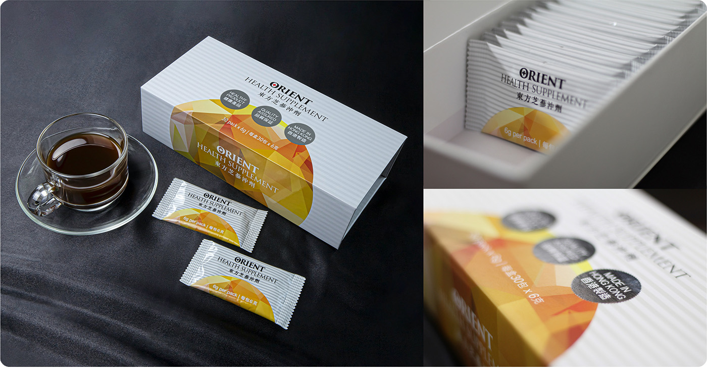
Orient Health Supplement is a healthy product, action for support vital energy, enhance immunity and improve deficiency. The production was authorized by China Natural Remedy Company Limited, and manufactured by HKIB - a wholly owned subsidiary company of The Chinese University of Hong Kong, one hundred percent made in Hong Kong. The product sell to different market in Mainland China, USA and Hong Kong. The packaging designed in simple and neutral style, display the brand name and product name very clearly with product features, to attract eye catching impression instantly.
This time, the duty of Yacca & Design Company is to design the packaging outlook and printing production. The packaging included the outer box and aluminium foil bag. The raw material is using 0.08mm aluminium foil and combined with OPP20, AL7 and CPE60. Through the different procedure and make it to a small sachet by pharmaceutical factory.
Usually, there has two kind of aluminium foil material, one is laminated aluminium (VMPET) and one is pure aluminium (AL). Laminated aluminium is cheap, but its covering and UV protection very poor, it may get wet if the quality period exceeded. The pure aluminium is expensive than laminated aluminium, but covering and UV protection more stronger, quality period much longer and won’t be get damp. The Orient Health Supplement and other famous brands in the market are made by pure aluminium.
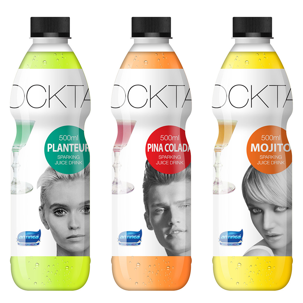
The product position in fashionable young people, represent freedom, rebellious, straight forward and independent. Based on our understanding of sparking soft drink market, cocktail products must continue to lead the marketing.
According to consumers behavior, Antinea has total three different tastes, they are fresh, elegant and mellow. Their liquor from France Cognac brandy, Russia vodka, and Cuban rum. They are purchasing a high-quality fruits such as peach, grapefruit and lemon from all over the world, using frozen technology to refine a safety and healthy product.
Young people all love in trendy product, so the packaging design must be audacious and innovation to make different with similar products in market. The bottle design in black and white color tone and fashionable model to present the vitality, passion and happiness, standing out the features of a cocktail product and make people feel surprising.
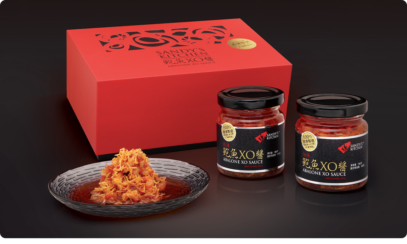
Sandy's Kitchen XO sauce is appeared in 80s Hong Kong. They are focus on delicious and natural ingredients, to explore the localize food tastes and to continue the mother's warm and sweetly.
Sandy's Kitchen Abalone XO sauce 100% manufacture in Hong Kong, all materials purchase from different countries including abalone, scallops, shrimp, ham and chili. Cooking with middle fire over two hours and keep stirring constantly, make all foods thermal equilibrium, golden color and loose.
The target audience of the products is high-end customers, the packaging design should match the consumer hobbies and attitudes. We understanding Chinese present traditional, our designer use a happiness red as a main color tone, combine with black and golden color to create an elegant appearance. Main visual using a trendy graphics to show all the ingredients. The pattern finishing with diecut design to increase the interest and characteristics.
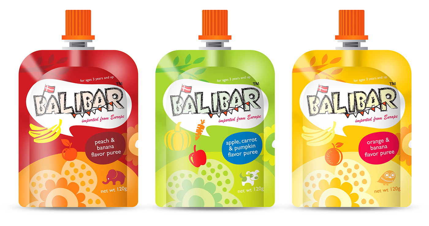
Today we care about our life, quality and stylish become our standard of judge, an unique tasty and high quality imported food are the best choice for consumers. The Balibar puree is using a traditional French technique to manufacture, from resource to finishing, purchase to process and integrative packing production line, make sure the product without any pollution and nutrients lost.
In order to access children soft drink market in Mainland China, Nanjing N.E. Oriental Import & Export Company entrust Yacca & Design Company to design a brand integration of Balibar, one of the most important is packaging design.
Balibar puree is an imported drinks from France, it's a specialized nutrition drinks for ages three years and up, there are different flavors for children. So the packaging design must trendy, lovely and represent they are an imported products. Designed in colorful illustration to attract the consumer attention and desire, of course their wonderful flavor also be young people choice.
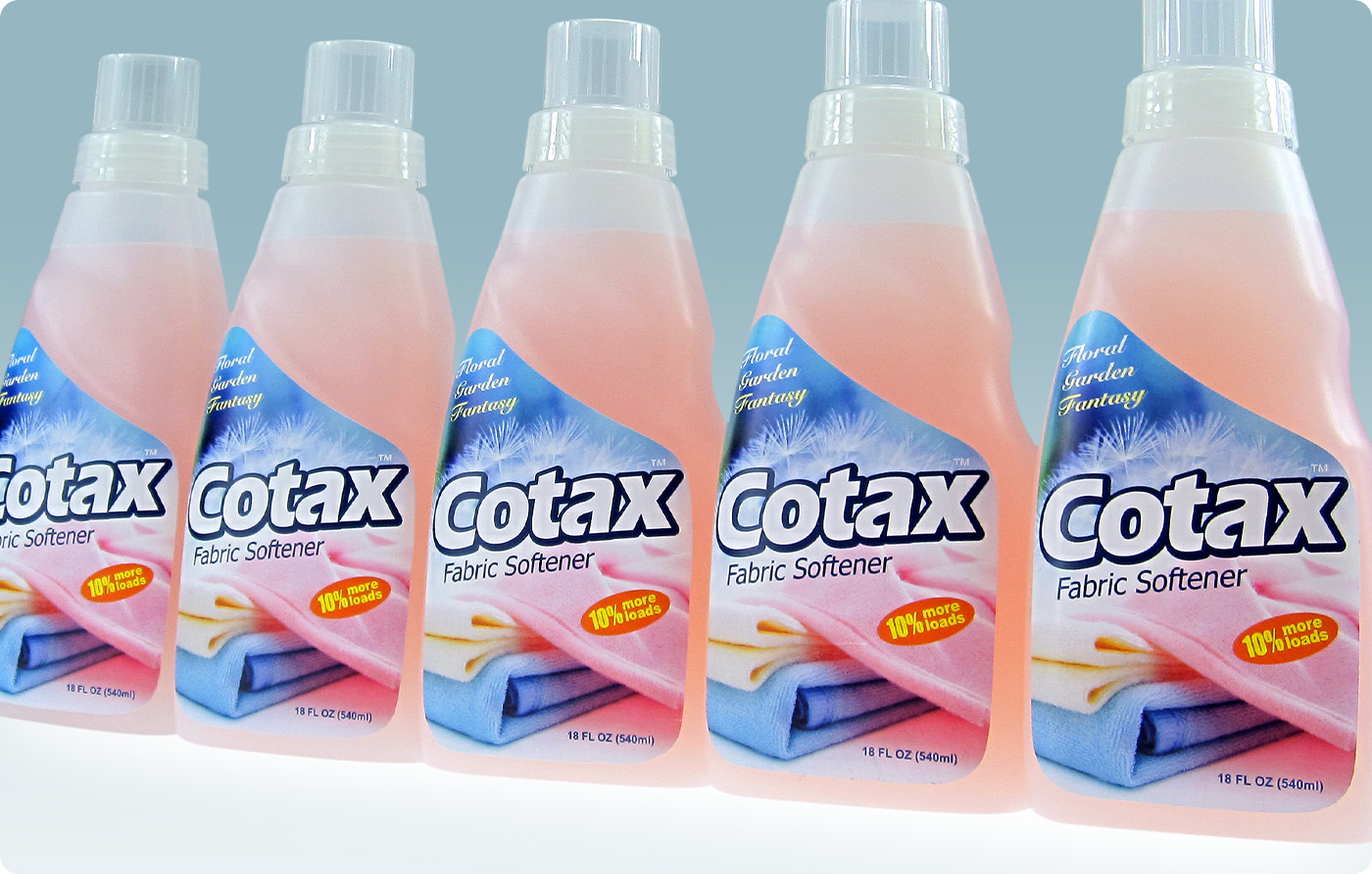
Cotax daily product company's philosophy is committed to provide a clean, comfortable and healthy cleaning supplies and clothing care products in advanced production technology. To make people health and ecological balance, provide more health living environment to consumers.
Cotax fabric softener are mainly exported to overseas market, the packaging design style should match with international market, a simple composition, bright color and standing out brand name let consumers more easy to choose from similar products immediately.
Their brand glamour and culture create stylish and comfortable life, they bring high quality life to consumers with natural concept.
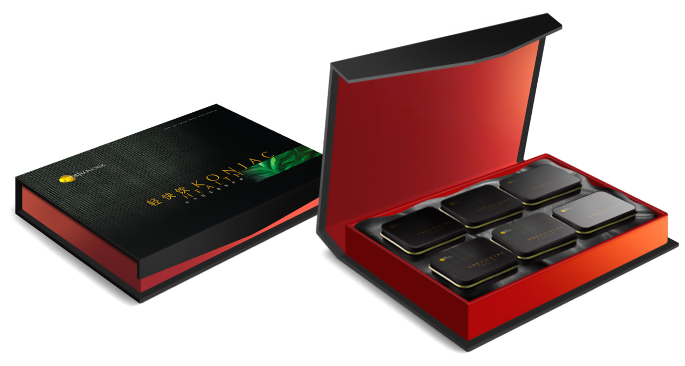
Wuhan Konifiber Biotechnology Co Ltd to entrust Hong Kong Yacca & design Company redesign the "konjac health" packaging, planning and build up a brand image. Attract to buy and make the consumers impressed, standing out from such products and trigger the consumer to buy.
There are countless healthy product brand on the market including an oral and electuary. To create a new brand is not difficult in China, but if you want to success and impressed with consumers, That is the systems planning and involves comprehensive marketing strategy. A clearly position can make the brand to targeted customer more precisely and reach the sales.
We suggest the new packing design in fashion, healthy and tasty style. Bring consumers easy to choose in the first feeling and to associate to the brand is natural, nutritional, safety, quality and price right, a healthy choice of modern consumers. The packaging design in modern style, combined with western and eastern elements.
An elegant and stylish packaging design with new brand icon, simple graphic design concept to deduce the product in high class position, extremely black is the main color, to target the healthy consumer with right brand positioning. The packaging designed with Chinese and Western combination to create a stylish and elegant style. We are using a fancy paper to increase hand feeling and match with the pattern design, the illustration is an oil painting of konjac, natural and harmonious color to show the products material and to present the classical packaging.
The packaging focus on the konjac image, product name printed with silver hot stamping and embossing effect, an elegant manner can help customers aware of the product and to build confidence.
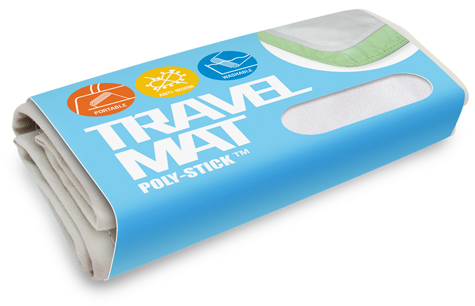
Poly-Stick material is a combination of two very distinct properties that there is no correlation between them at all. However, this amazing material provides not only insanely strong friction to stop any slipping, but also the absolute water-proof property not to allow water penetration.
In the beginning, Poly-Stick material has been applied to TV game dance mats to show its anti-slipping power, successfully offering a safe environment to the dancing players from slipping. It has been very well received in the market due to the only half of its particular properties. Now, it is time for Poly-Stick to contribute its full function in the other different applications.
Poly-Stick has very strong adhesion that produces friction on various materials such as wood, ceramic, metal, plastic, glass, and clothing fiber. It is easy to place, remove, and then replace Poly-Stick without destroying the contact surfaces or leaving any trace like traditional tape.
Packaging design with common art paper material, clearly product name and various functions of illustrations to lock up the target customer and show the application of product very clearly.

As a new brand base on the Southern China area, break out in many products is not so easy, it must have the appropriate brand positioning and new packaging design.
Xin Yuan foods is a reliable food company, specializing in the production of high quality and delicious biscuit. According to their technology and innovation, they get the industry recognized reputation in a short period of time.
To occupy a position in an intense competition market, Yacca and Design Company to consider a new brand and customers to make interaction, especially for youth fashion people can enjoy a new tastes and its culture.
To give a brand distinctive position, the inspiration come from the characteristics from an interests to explain and attract young target customers. Colorful packaging, standing out branding and three biscuit products include peanut, milk and garlic covering a large number of consumers and wholesalers after their promotion.
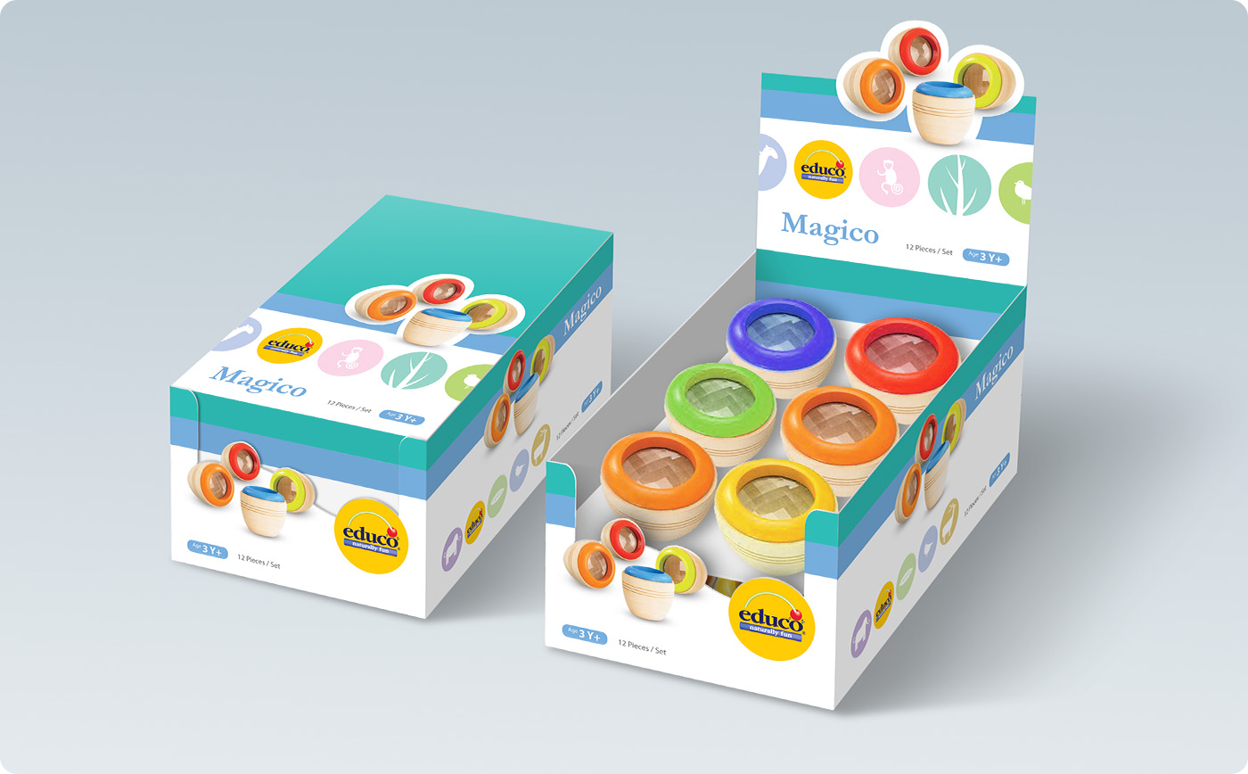
Today, Hape International (Hong Kong) Limited is a multifaceted, multinational company selling toys in over 50 countries. But Hape’s ideals extend far beyond creating safe, innovative products. A lifetime commitment to learning and education, led him to work with local communities educating their children by building schools and enhancing their lives by teaching them to use available resources. Social responsibility, education, ecology, and innovation are ingrained in Hape’s heritage, and are reflected in every aspect of the Hape business, past, present, and future.
The new dynamic visual identity are motivating, and inviting people to have naturally fun of a unique experience. To match up the new identity system in naturally and green inspirations, we are redesign the different product series packaging, the new packaging design not just make customers to understanding the new brand identity system, the packaging also with display function. Welcome to try anytime and make customers and EDUCO product get closer.
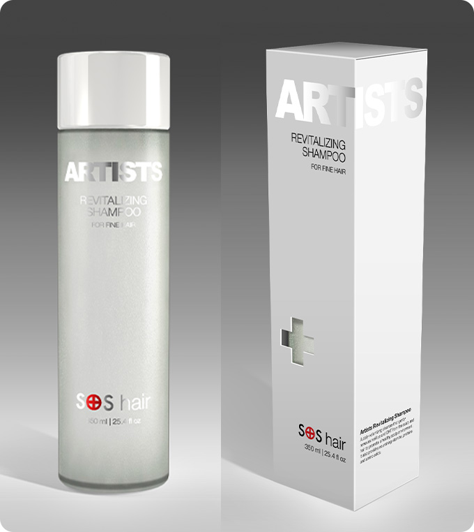
With many years of experience in marketing, we know many of packaging design are just using clear and simple style to represent their professional image, such as Shiseido, Fancl, Vidal Sassoon, Nioxin, etc.
All high class packaging are only using simple typeface and color to represent their product image. They are only using different kind of shape or material and printing technique to shown the design. Yacca lock up the brand position of ARTISTS products in high class image, professional, clean and simple design.
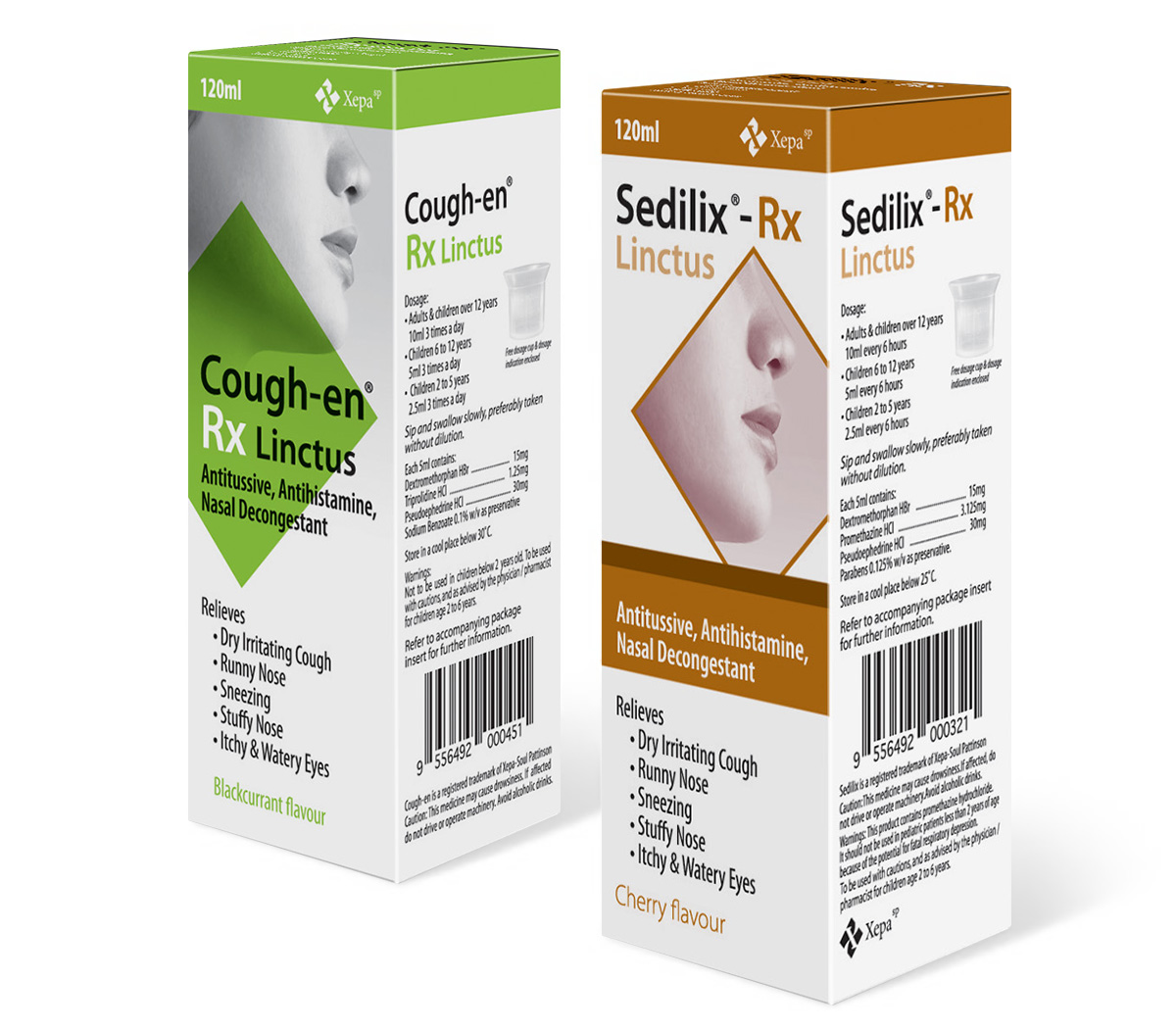
Xepa products are designed for safe and efficacious administration, provided in a variety of forms tailored to their purpose. Xepa aims to be the first to introduce off-patent pharmaceuticals to Malaysia. To this end, their laboratories develop products - formulating, designing and validating - that are then manufactured to exacting standards. From there, the marketing team researches, brands, positions, promotes and handles sales of the products to private and government-run pharmacies, clinics and hospitals, within Malaysia and the region.
Xepa go to revamp the formulation for two existing products and going to position them as two new products. Special highlight should be focus on the new brand "Rx". At the same time, they would like to keep some identities on the current pack. Yacca to suggest something can differentiate between these two generation products, yet people still can recognize continuation from previous generation. The creative concept more OTC look, but not too much.。
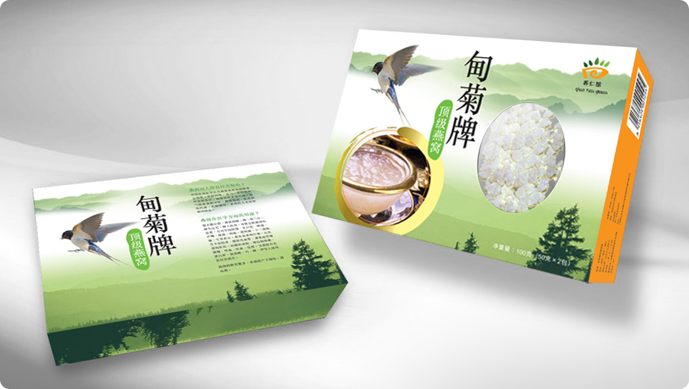
Traditional Chinese medical science thinking the bird's nest has the effect of nurture and good for health, a pristine complexion food for modern people. Dianju bird's nest produced by swallow grows in the Burmese natural forest, the bird's nest rarely and luxury, suitable for all kind of people, especially for women more effectively.
Packaging design mainly to promote the product attribute and background, consumers can very clearly see through the product quality from packaging. Packaging design using Burma mountain forest as the graphic background, concise and elegant design make consumers understand product attribute and have purchasing desire immediately.
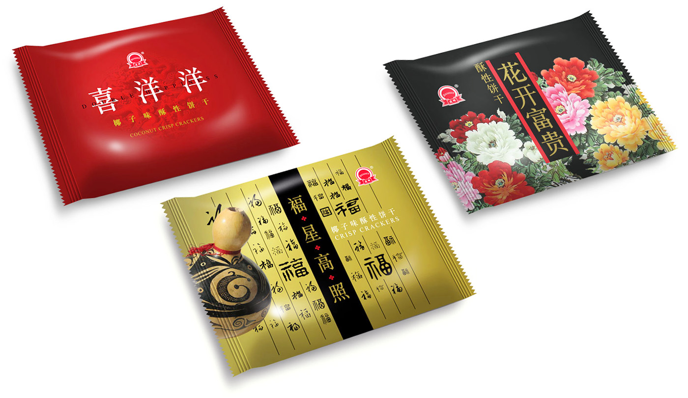
The company mainly produces medium and high-grade biscuits, mid-autumn festival moon cake etc. With high quality materials and nice packaging of advantage get customers recognition.
Huahui food company launch a series of happiness festival biscuits during the lunar New Year. They entrust our company to design by traditional Chinese style of packaging, through the communication with the customers and marketing analysis, we are created a series combinative western of simply style product packaging design, a breakthrough layout and color make a good sales after product launch.
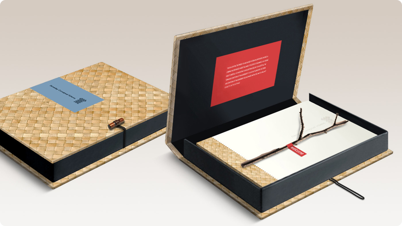
Shimei Bay located in southeast Hainan gulf region, close to Haikou city around 160 km. Generate by two crescent shape natural gulfs, Shimei Bay has incomparable naturally and pure resources. Projects are located in the gulf coast, eastern is near the murmuring valleys, south to unlimited gulf, northern surrounded by green mountains, boasts beautiful scenery, with mountain and water, lushly grasses, and fully with the pure and natural beauty.
EDAW cooperate with resort construction company, through the Hainan local culture characteristic and different inspiration of basic unique environment resources, reinterpret to present landscape design element essence, rebuild a unique resort position of district, and make this resort district more outstanding in Hainan region.
The scheme visual design should show Hainan local culture completely, natural and pure beautiful characteristic. Our design team used a cane woven for packing materials, wooden button etc, design a Chinese and Western style combination outer packaging. Scheme book cover design also with same materials, in order to increase the natural elements. Attach with a branch to represent “Welcome to Shimei Bay”. The design has a very good comment and affirmation by EDAW.
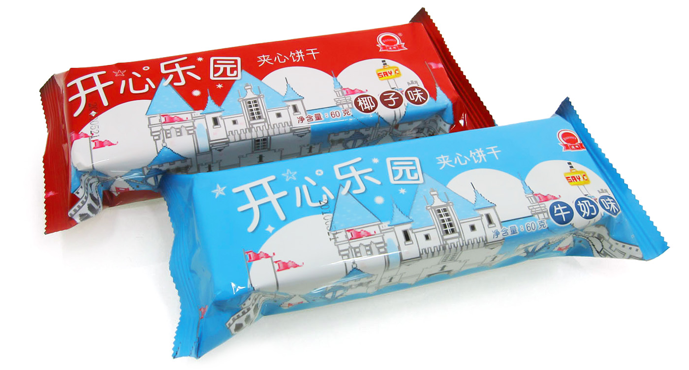
The Huahui food company mainly produces medium and high-grade biscuits, mid-autumn festival moon cake etc. With high quality materials and nice packaging of advantage get customers recognition. The company launches a Happy Paradise series biscuits, tastes fresh and crisp delicious. Their target customers are trendy young people and white collar.
Through the communication with the customers and marketing analysis, we are created a series product packaging design with thematic playground style, lively, cutely and colorful image layout. A new packing design makes good sales in market.

Le Classique is a brand under Lechino, it is a gift design and manufacture company, products mainly export to oversea market, and it is including office accessories and fine jewelry. The branding position in high-class. A series of stationery packaging design use a cheap material such as EVA and PVC. Display the character and functions of different product series, the brand image are attractive and outstanding.
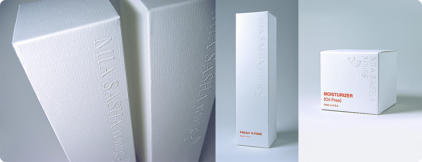
The MIA SASHA young skin correction and restoration program for the most common skin disorders, professional skincare system that is designed to prompted health and beauty. MIA SASHA young packaging design in simply style, pure white color design printed on Conqueror texture paper, packaging are outstand the elegant brand image, and have an important position in cosmetics and skincare market.
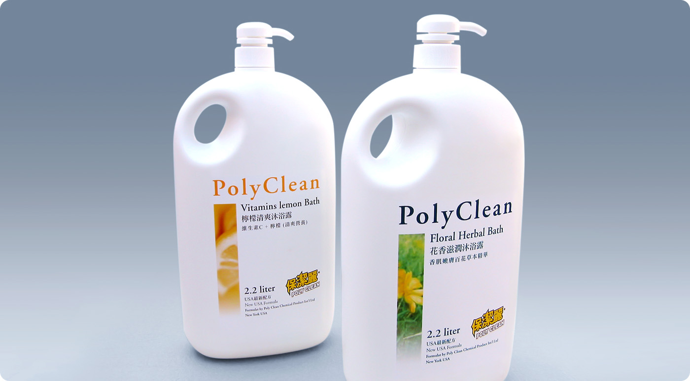
PolyClean Chemical Company founded in 2003, he is an independent soap production pioneer in Mainland China. PolyClean is modern enterprise, the company business in high quality washing product. Specializes in the production of various consumer products, such as the facial soap, perfume soap, shampoo, body wash etc. PolyClean produce high class and innovative product which are distributed all over the world.
PolyClean body wash make by imported material and technology, mild nature, have moist skin effect and good smell, suitable for all kind of people use. Product packaging and pure and fresh, simply design, outstanding English brand name, let the customer purchase more convenient.
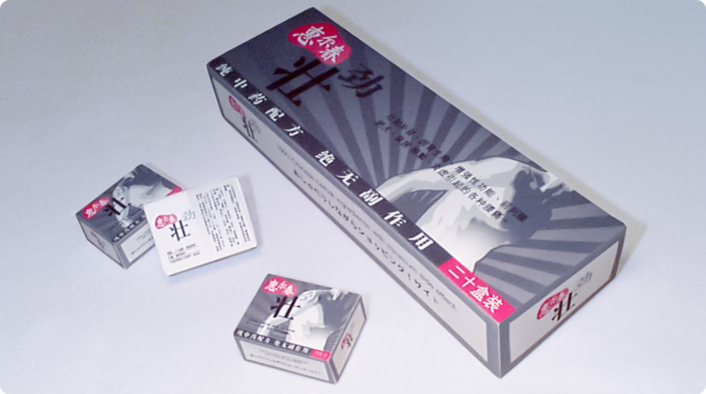
HuiErChun is an exclusive new health care medicine from Nanchang SangHai pharmaceutical factory. Use a ginseng, caterpillar fungus, velvet antler, medlar, barrenwort such valuable Chinese herbal medicine. It is a pure Chinese medicine with new technology. Various medicinal contain human necessary special effective materials. Especially velvet antler for kidney, blood activation, strong bones and muscles, veins stably, warm and recover effect. Caterpillar fungus to kidney strong, lung care, stop bleeding and patching.
HuiErChun passed many clinical trials and cases approval, significant good for kidney function, strong muscles and enhance immunity.
Packaging design promote product attributes, show male strong character, product most popular when promote into the market.
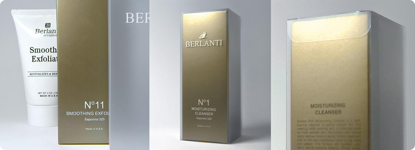
Berlanti of California Skincare Program introduces a new Skin Correction and Restoration Program with AHA from fruit acids for your Optimum In-Home Facial Kit. This brand is well known as a highly recommended skin care product line established in 1992 in many countries such as Japan, Korea, Hong Kong, Germany, and Switzerland.
Berlanti skin care products are made of carefully selected ingredients with the right combination in each product. The brand offers an approach as a significant addition to the traditional approach of correcting the skin condition and re-storing it to its original condition through topical application of the creams and lotions.
A series of total 11 packaging design use consistence format with metallic paper box and transparent PVC, simply design are attractive and outstanding.

Quick results of X'TRA TRIM can make slim body goal within 24 hours comfortably. Out of imagination effect and let people unbelievable when first time use! X'TRA TRIM has a slim body products series in the market. X'TRA TRIM product series by its unique curative effect becomes popular rapidly in Hong Kong, Japan, Southeast Asia and Europe market, make obesity confusing people rebuild their confidence, and it is priority slim products for different kind people and professionals.
Through communication with customer and product analysis, we are understand the food can quickly obvious, Yacca decided to design with space shuttle for the rapid and high-tech concept, respectively represent X'TRA TRIM produce in high technology, the product effectiveness and characteristics.
© 2025 Yacca & Design Company. All rights reserved.
